Introduction
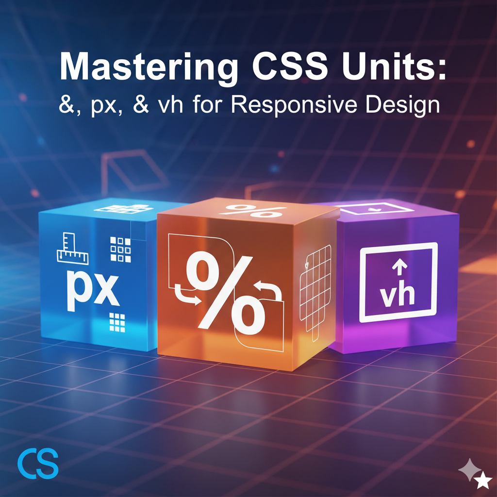
CSS units are the backbone of modern web design. Whether you’re creating a responsive layout, a full-screen hero section, or pixel-perfect icons, understanding %, px, and vh is crucial.
In this guide, you’ll learn:
- How each unit works
- When to use it
- Pros and cons
- Real code examples
By the end, you’ll confidently use these units for flexible, professional, and responsive websites.
1. Pixels (px) – Absolute Unit
What is px?
- A pixel represents a fixed dot on the screen.
- It’s absolute, meaning it won’t change with parent elements or screen size.
When to Use Pixels
- Borders and outlines
- Icons or logos
- Fixed width sections
Example
.box {
  width: 200px;
  height: 100px;
  background-color: lightblue;
}
Pros & Cons
- Pros: Precise control, consistent across browsers
- Cons: Not responsive, doesn’t scale on mobile
2. Percentages (%) – Relative to Parent
What is %?
- Relative to the parent element’s size.
- Great for fluid layouts and responsive design.
How % Works
- Width, height, padding, and margin can all use
%. - Example: A
divwithwidth: 50%is half the width of its parent container.
Example
.container {
  width: 600px;
  height: 400px;
  background-color: lightgray;
}

.child {
  width: 50%;
  height: 50%;
  background-color: coral;
}
Pros & Cons
- Pros: Flexible and responsive, works well in grids
- Cons: Depends on parent size, can be tricky if parent changes
3. Viewport Height (vh) – Relative to Screen
What is vh?
1vh= 1% of the viewport height.- Perfect for full-screen sections, hero banners, and vertical responsiveness.
Example
.hero {
  height: 100vh;
  background: linear-gradient(to bottom, #ff7e5f, #feb47b);
}
Pros & Cons
- Pros: Adapts to screen height, great for responsive sections
- Cons: May create scroll issues on small screens
4. Comparison Table
| Unit | Type | Relative To | Best Use Case |
|---|---|---|---|
px | Absolute | Screen | Borders, icons, fixed sections |
% | Relative | Parent | Flexible layouts, grid items |
vh | Relative | Viewport height | Full-screen sections, hero banners |
5. SEO & UX Tips for CSS Units
- Combine units smartly:
%for layout,pxfor precision,vhfor screen-based sections. - Avoid
pxfor font size; use%,em,rem, orvhfor responsive text. - Test on multiple devices for mobile-first design.
- Include code snippets, live demos, or screenshots to improve engagement.
6. Conclusion
Mastering CSS units %, px, and vh helps you:
- Build responsive layouts
- Create pixel-perfect designs
- Optimize user experience across devices
Using the right unit in the right context ensures your website looks professional, modern, and mobile-friendly.