Introduction
CSS Flexbox and Grid are powerful layout tools that every web developer should master.
Whether you’re building a simple navigation bar or a complex multi-column layout, knowing when to use Flexbox or Grid can make your designs responsive, clean, and maintainable.
In this guide, you’ll learn:
- Key differences between Flexbox and Grid
- When to use each one
- Practical tips for modern web layouts
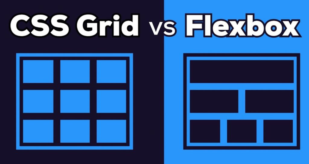
1. What is CSS Flexbox?
Flexbox (Flexible Box) is designed for one-dimensional layouts, either in a row or a column.
Key Features:
- Align items horizontally or vertically
- Space items evenly
- Order items without changing HTML
Example:
.navbar {
  display: flex;
  justify-content: space-between;
  align-items: center;
}
Best Use Cases:
- Navigation bars
- Small UI components
- Aligning items in a single row or column
2. What is CSS Grid?
Grid is designed for two-dimensional layouts – both rows and columns.
Key Features:
- Create complex layouts easily
- Control both rows and columns simultaneously
- Place items precisely using grid lines
Example:
.container {
  display: grid;
  grid-template-columns: repeat(3, 1fr);
  gap: 20px;
}
Best Use Cases:
- Full-page layouts
- Multi-column content
- Dashboards or card layouts
3. Flexbox vs Grid – Side by Side
| Feature | Flexbox | Grid |
|---|---|---|
| Layout | 1D (row or column) | 2D (rows and columns) |
| Alignment | Easy vertical/horizontal alignment | Advanced placement |
| Complexity | Simple layouts | Complex layouts |
| Responsiveness | Works well for smaller components | Works well for page-wide layouts |
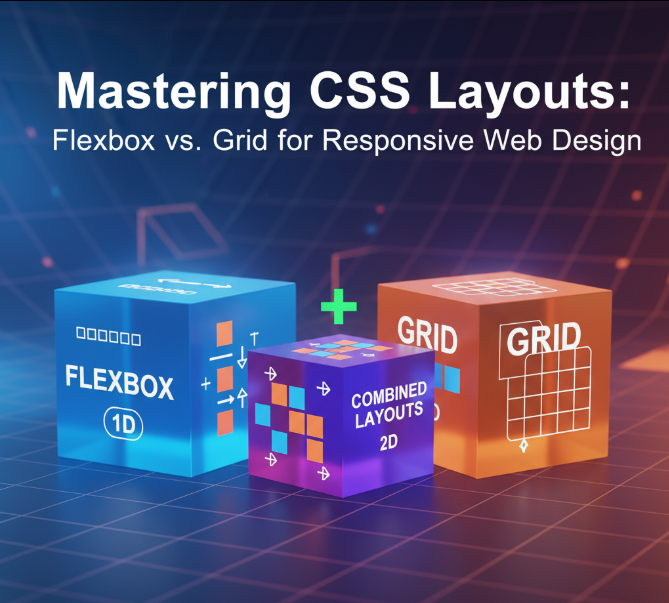
4. Tips for Using Flexbox and Grid Together
- Use Flexbox for components, Grid for the overall page layout.
- Combine
frunits (Grid) with Flexbox spacing for responsive design. - Use media queries with Flexbox/Grid to adjust layouts on different screens.
- Avoid overcomplicating – pick the right tool for the right task.
Example Combination:
.page {
  display: grid;
  grid-template-columns: 1fr 3fr;
  gap: 20px;
}

.sidebar {
  display: flex;
  flex-direction: column;
  gap: 10px;
}
5. SEO & UX Tips
- Use semantic HTML (header, main, footer) with Flex/Grid for better SEO.
- Optimize page load by avoiding unnecessary wrappers.
- Test layouts on desktop, tablet, and mobile for responsive UX.
- Include code snippets in your blog for engagement and better SEO ranking.
6. Conclusion
Understanding Flexbox vs Grid is crucial for modern web design.
- Flexbox → Best for 1D layouts and component-level alignment
- Grid → Best for full-page, 2D layouts and complex structures
Using them together wisely ensures your website is responsive, maintainable, and visually appealing.