1. પરિચય – CSS Layout કેમ શીખવું જરૂરી છે?
વેબ ડિઝાઇનમાં responsive અને attractive layout બનાવવું ખુબ જ મહત્વનું છે. CSS Flexbox અને Grid એ modern layout systems છે જે developer ને easily complex layouts બનાવવામાં મદદ કરે છે.
આ guide માં આપણે CSS Flexbox & Grid Gujarati માં સમજશું, સાથે real examples જોઈશું.
2. CSS Flexbox શું છે?
Flexbox એટલે Flexible Box Layout, જે 1-dimensional layout માટે use થાય છે — એટલે કે rows અથવા columns માં items align કરવા માટે.
2.1 Flexbox ના ફાયદા
- Responsive layout easy
- Alignment control (center, space-between, વગેરે)
- Itemsનું auto-resizing
2.2 Flexbox Basic Syntax
આ એક flex container નક્કી કરે છે; આપેલા value પર આધારિત inline અથવા block બની શકે છે. આ તેના બધા direct children માટે flex context સક્રિય કરે છે.
.container {
  display: flex;
}
નોંધ લો કે CSS columns નો કોઈ અસર flex container પર થતો નથી.
2.3 Flexbox Main Properties
| Property | Description |
|---|---|
display: flex; | Flexbox activate કરે છે |
flex-direction | Row કે Column select કરે છે |
justify-content | Main axis alignment |
align-items | Cross axis alignment |
flex-wrap | Items wrap થાય કે નહિ |
Example – Center Items Using Flexbox
<div class="flex-container">
  <div class="item">A</div>
  <div class="item">B</div>
  <div class="item">C</div>
</div>
.flex-container {
display: flex;
justify-content: center;
align-items: center;
height: 200px;
background: lightblue;
}
.item {
background: orange;
padding: 20px;
margin: 5px;
}3. CSS Grid શું છે?
CSS Grid layout 2-dimensional system છે — એટલે rows અને columns બંને manage કરી શકાય.
3.1 CSS Gridના ફાયદા
- Complex layouts easy
- Rows & columnsનું perfect control
- Gap, alignment અને spanning easy
3.2 CSS Grid Basic Syntax
.container {
  display: grid;
}
3.3 Grid Main Properties
| Property | Description |
|---|---|
display: grid; | Grid activate કરે છે |
grid-template-columns | Column structure define કરે છે |
grid-template-rows | Row structure define કરે છે |
gap | Row અને Column gap |
grid-column | Item કઈ columnમાં આવશે |
grid-row | Item કઈ rowમાં આવશે |
Example – Simple CSS Grid
<div class="grid-container">
  <div class="item">1</div>
  <div class="item">2</div>
  <div class="item">3</div>
  <div class="item">4</div>
</div>
.grid-container {
display: grid;
grid-template-columns: repeat(2, 1fr);
gap: 10px;
background: lightgreen;
}
.item {
background: pink;
padding: 20px;
text-align: center;
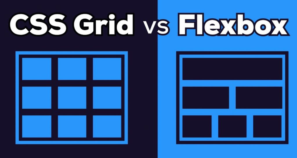
}4. Flexbox vs Grid – ક્યારે શું વાપરવું?
| Feature | Flexbox | Grid |
|---|---|---|
| Layout | 1D | 2D |
| Best For | Alignment | Page Layout |
| Learning Curve | Easy | Moderate |
5. Responsive Layout Example (Flexbox + Grid Mix)
<div class="page-layout">
  <header>Header</header>
  <nav>Menu</nav>
  <main>Content</main>
  <aside>Sidebar</aside>
  <footer>Footer</footer>
</div>
.page-layout {
display: grid;
grid-template-columns: 1fr 3fr 1fr;
grid-template-rows: auto 1fr auto;
gap: 10px;
}
header {
grid-column: 1 / 4;
background: #ccc;
}
nav {
background: lightblue;
}
main {
background: lightgreen;
}
aside {
background: lightpink;
}
footer {
grid-column: 1 / 4;
background: #ccc;
}Example – Product Card Layout (Grid + Flexbox)
આ layout માં:
- CSS Grid → આખા products list માટે (rows & columns)
- CSS Flexbox → દરેક product card અંદરના content align કરવા માટે
HTML
<div class="products">
  <div class="product-card">
    <img src="https://via.placeholder.com/150" alt="Product">
    <div class="product-info">
      <h3>Product 1</h3>
      <p>₹499</p>
      <button>Add to Cart</button>
    </div>
  </div>

  <div class="product-card">
    <img src="https://via.placeholder.com/150" alt="Product">
    <div class="product-info">
      <h3>Product 2</h3>
      <p>₹799</p>
      <button>Add to Cart</button>
    </div>
  </div>

  <div class="product-card">
    <img src="https://via.placeholder.com/150" alt="Product">
    <div class="product-info">
      <h3>Product 3</h3>
      <p>₹999</p>
      <button>Add to Cart</button>
    </div>
  </div>
</div>
CSS
/* Grid for Product Listing */
.products {
  display: grid;
  grid-template-columns: repeat(auto-fit, minmax(200px, 1fr));
  gap: 20px;
  padding: 20px;
}

/* Flexbox for Product Card Layout */
.product-card {
  display: flex;
  flex-direction: column;
  border: 1px solid #ccc;
  padding: 15px;
  background: #fff;
}

.product-card img {
  width: 100%;
  height: auto;
}

.product-info {
  display: flex;
  flex-direction: column;
  justify-content: space-between;
  flex-grow: 1;
}

.product-info h3 {
  margin: 10px 0 5px;
}

.product-info p {
  font-weight: bold;
  color: #27ae60;
}

.product-info button {
  background: #27ae60;
  color: white;
  padding: 8px;
  border: none;
  cursor: pointer;
  margin-top: 10px;
}

.product-info button:hover {
  background: #219150;
}
7. FAQs – CSS Flexbox & Grid
Q1: Flexbox અને Grid વચ્ચે મુખ્ય તફાવત શું છે?
Ans: Flexbox 1D layout માટે, Grid 2D layout માટે.
Q2: Flexbox responsive design માટે સારું છે?
Ans: હા, Flexbox સાથે responsive layouts બનાવવું ખુબ easy છે.
Q3: Grid માં responsive columns કેવી રીતે બનાવવું?
Ans: repeat(auto-fit, minmax(200px, 1fr)) ઉપયોગ કરો.
8. નિષ્કર્ષ
CSS Flexbox & Grid modern layout બનાવવા માટે બે powerful tools છે. Beginners પહેલા Flexbox શીખે પછી Grid પર જાય.